
CSS3 - 2DTransform & Transitions w3c
intro | transitions | scale | rotate | translate | skew | origin | examples | browser support
Transform - Translate
THE PROBLEM WITH EXAMPLES 1 and 2 using the flowers below is that for the hover to work corrrectly you need to have the mouse indicator over the image during the hover and when the flower moves up or across the mouse indicator is no longer actually over the image. IT WORKS BETTER in example 3 with the train because the mouse indicator is always over the image during hover:
1
Hover over the images to activate the translate.
transform: translate (x, y);
x represents the number in pixels the object will move along the horizontal axis.
y represent the number in pixels the object will move along the vertical axis.
 transform: translate (300px;);
The image moves from left to right on the x access.
transform:translate(300px);
transition-timing-function: ease;
transition-duration: 1s;
2
transform: translate(0px, -400px)
The image moves up on the y access. Use a positive number if you want it to move down.
The first set of styles will allows animation when the user rolls out:
#translate{
-moz-transition-timing-function: ease;
-moz-transition-duration: 1s;
-webkit-transition-timing-function: ease;
-webkit-transition-duration: 1s;
-ms-transition-timing-function: ease;
-ms-transition-duration: 1s;
-o-transition-timing-function:ease;
-o-transition-duration: 1s;
transition-timing-function: ease;
transition-duration: 1s;
}
These are the main set of styles that will trigger the transform on the hover. They were placed on the first image.
#translate:hover{
-moz-transform: translate(300px);
-moz-transition-timing-function: ease;
-moz-transition-duration: 1s;
-webkit-transform:translate(300px);
-webkit-transition-timing-function: ease;
-webkit-transition-duration: 1s;
-ms-transform:translate(300px);
-ms-transition-timing-function: ease;
-ms-transition-duration: 1s;
-o-transform:translate(300px);
-o-transition-timing-function: ease;
-o-transition-duration: 1s;
transform:translate(300px);
transition-timing-function: ease;
transition-duration: 1s;
}
Alert
Mobile devices do not responed to the hover therefore you need to click on the image/s in order to see the effect.
Even though by clicking on the image you can generate the transform it still does not work correctly on touch devices. Because there is no hover the reverse transform cannot happen when the user rolls off but it is generated when the user clicks on another transform.
Translate
3
Moving train code below
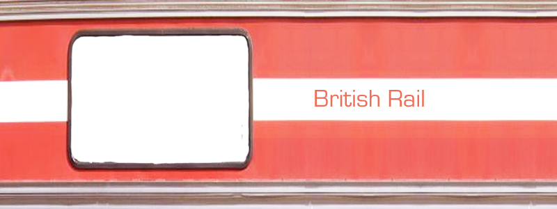
My train has the window that is transparent in-order for you to see the people in the station but it is not necessary to have two images .
- First I created an image that is more than twice as long as the opening in the figure below:
<figure id="displayRedtrain">
<img src="images/trainFront.png" alt="example for translate - train" id="redTrain">
</figure>
- Next is the CSS for the figure
I have a background image which shows the people in the station.
The figure has an overflow:hidden in order for the user not to see the entire train, I included the outline to emphasis the box.
#displayRedtrain{
width: 300px;
height: 300px;
outline:1px;
outline-color: #aaa;
outline-style: solid;
border-width: 7px;
border-color: #ccc;
border-style: solid;
background-image: url(cssImages/trainstation.jpg);
overflow: hidden;
}
- The following CSS moves the train back to its orginal position once the user rolls out>/li>
#redTrain{
margin-top: 0px;
-webkit-transition: all 1s ease-out;
-moz-transition: all 1s ease-out;
-o-transition: all 1s ease-out;
-ms-transition: all 1s ease-out;
transition: all 1s ease-out;
margin-left: -80px;
}
Moves the train when the user rolls over
- #redTrain:hover{
-moz-transform: translate(-300px);
-moz-transition-timing-function: ease;
-moz-transition-duration: 1s;
-webkit-transform:translate(-300px);
-webkit-transition-timing-function:ease;
-webkit-transition-duration: 1s;
-ms-transform:translate(-300px);
-ms-transition-timing-function:ease;
-ms-transition-duration: 1s;
-o-transform:translate(-300px);
-o-transition-timing-function:ease ;
-o-transition-duration: 1s;
transform:translate(-300px);
transition-timing-function:ease ;
transition-duration: 1s;
}