join: new@juude


get alerts for new articles


CLOSE WINDOW

join: new@juude


get alerts for new articles


CLOSE WINDOW
typography

Getting Started


intro | typeface | serif or not | sans serif | starting

If you are just starting out as a web designer begin by looking at hundreds of web sites, advertisments, magazines, books and experiment a lot. Take risks and do not be satisfied with your first designs or typeface choices. Redesign over and over again and pay attention to the details. Below are some typefaces to get you started.

sans serif


Kabel
Meta
Gotham
Optima
Avant Garde
Hypatia Sans

sans serif


Helvetica
Univers
Futura
Frutiger
Akidenz Grotesk
Gill Sans

Big Flannel
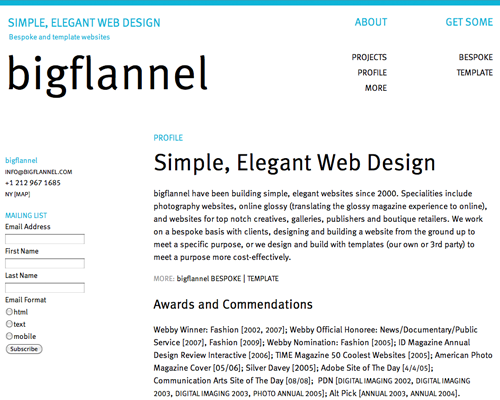
Big Flannel The Font is FF Meta Web Pro

serif

Rockwell
Serifa
Didot
Bodoni
Warnock Pro
Myriad

serif


Garamond
Caslon
Mrs. Eaves
Baskerville
Sabon
Palatino

IBM
IBM

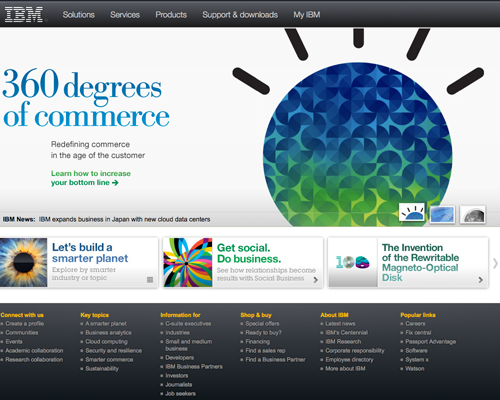
Originally IBM was using serifs for their titles as you can see in the image above but since I created this page they have started using all sans serifs for their titles.