principles
unity
balance
emphasis
rhythm
proportion
elements
interactive
home: juude.info


Emphasis


Emphasis is also called Focal Point or Dominance.

The object being emphasized should grab the user's attention immediately and make them want to look further.

Our eye is drawn first and foremost to images of faces, and you need to be careful that the pull towards the face is not so great that the viewer's eye does not take in the rest of the design.

Color, contrast, size and directional devices also work to emphasis a particular element of the design.
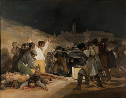
The Third of May - Goya
The Third of May 1808  Goya

Emphasis


The main emphasis is on the prisoner.

The emphasis is achieved by contrast and direction.

The prisioner stands out in the white shirt which is lighter than any other element. In addition all the guns are pointing towards him which leads our eye towards him.
Venus Rising

SEO

Emphasis


Emphasis is achieved in the design above by the use of position, size and color.

SEO is in the center of the design, it is larger than any of the other words and is red against black and white.


Any color would have stood out against the black and white letters but red is the most dominant of colors giving the SEO even more impact.