Interactive Design
In addition to the Principles of Design there are four Principles of Interactive Design that designers also need to follow when creating interactive pieces.
Most of the time with fine art and illustration the viewer takes their time and will discover various aspects of the design leisurely but with interactive design the user wants to know what is going on immediately.
Fine art and illustration can be ambiguous, interactive design cannot.
The four Principles of Interactive Design, Alignment, Contrast, Consistancy and Proximity are simular to some of the Principles of Design but have slightly different connotations.
Gestalt Principles of Perception, Memory, Metaphors and Affordance also play a role in interactive design but I will get to these topics in a later discussion.
Alignment
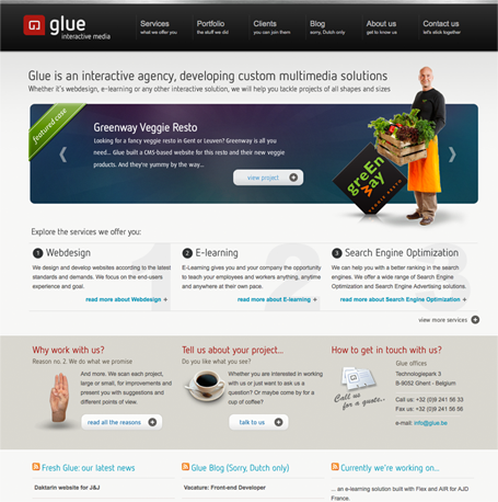
Use alignment when placing the majority of your interface design elements, this will help to create unity within the design and aid the user's eye to easily move from one element to the next. The example, Glue's web site shows an interface where almost all of the elements are aligned both across and down.
Proximity
The elements that are grouped together are perceived as being related to one another.
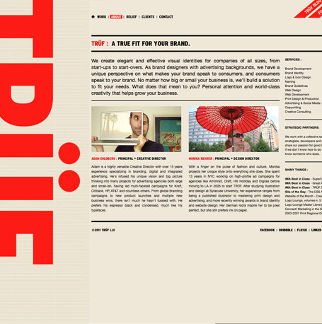
In the example Recent Posts obviously have their own area. The menu at the top is also clearly define in a space of it's own. The blog and the comments are grouped together and have their own alotted area.
Consistency / Repetition
Consistency makes for a better user experience. The colors, typography and element positions need to be consistent from interface to interface.
As the user navigates from one interface to the next there should not be any apparent movement of any of the elements.
Contrast
Contrast is used to make an element stand apart and be noticed. Most of the time it is applied by color and size. When used with typography it helps lead the user down the page and gives an element of interest,


