CSS Multi-Columns W3C
Example showing CSS columns and Media Queries
No Floats
Create Columns without floats. When you create columns in CSS, the columns are created automatically. Floats are not required. The CSS Multi-column Layout Module has been around for a long time but until recently only Firefox could interpret it. Firefox has been now been joined by the webkit browsers, Safari and Crome and also Opera, all of which support css columns. IE9 does not support the multi-column layout. Internet Explorer will ignore the multi-column styles and display a single column.
Columns
You can use the body as the selector in the css or another containing element. Don't forget that you need to also specify the vendor code in the CSS.
Although I am are using Multi-Columns as an example of how you can create a web page that is liquid they also work in a static/flexible layout.
Columns used with Media-Queries
When the multi-column layout is used with Media-Queries it is very easy to design for a variety of browser window sizes including mobile devices.

Count
column-count: lets you specify the amount of columns
selector {
column-count: 2:
}
Width
column-width: you can specify auto and then a width. The browser will then divide the window into the as many columns as the width of the window will allow.
selector {
column-width: 120px;
column-count: auto;
}
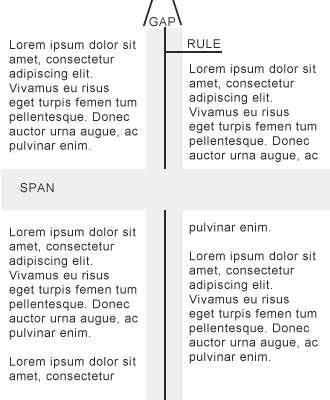
Gap
column-gap is the area between two columns. The gap is in addition to the width of the column.
selector {
column-gap: 50px;
}
Rule
column-rule is placed in the center of the gap
selector{
column-rule-width: 2px;
column-rule-style: solid;
column-rule-color: #777;
}
Fill
column-fill: the values are balance and auto.
Balance: Fills the content equally between columns if possible.
Auto: Fills the columns sequentially – This property is only used if the height of the columns has been constrained. A height would not be placed on the column rather the containing element.
selector{
column-fill: balance;
}
ALERT: The following items either do not work or only partially work at the moment (March 2011) in any browser.
Span
– will span one colum but not all (March 2011)
The span must be placed on block level elements.
When the span is applied the element should span across columns.
You either give "none" or "all" or number for the amount of columns.
At the moment the span does not appear to work correcty in any browser.
For the following styles I get the same result the span is only across one column
selector{
column-span: all; background: #777;
}
selector{
column-span: 1; background: #777;
}
selector{
column-span: 2; background: #777;
}
Break
Column-breaks do not appear to be supported in any browser at this time (March 2011).
Column breaks are placed on block level elements.
When the layout is presented in columns the browser needs to determine where to place the breaks. The breaks are determined by:
break-before: values: auto, always, avoid, column, avoid-column
break-after : values: auto, always, avoid, column, avoid-column
break-inside: auto, avoid, avoid-column
- auto
Neither forces nor forbid a column break before, after, or inside - always
Always force a page break before - after
Avoid a column break before , after, or inside - column
Always force a column break before or after - avoid-column
Avoid a column break before, after, or inside.
The following would prevent a information breaking across columns within a paragraph
p{
column-break-inside: avoid;
}
Example showing CSS columns and Media Queries


